EkoMarket
One identity. 21 stores.
The challenge
EkoMarket is Norway’s largest grocery chain for Eastern European food. We have followed them since the first store opened in 2017 — and the identity we made back then is today on 21 stores across the country.
A fast-growing chain has to look the same everywhere. The same signage, the same colours, the same tone in the brochure as in the ad — whether the store is in Stavanger or further north. And all of it has to be produced by different suppliers without drifting.
- 2017
- Working together since
- 21
- Stores carrying the identity
- 24
- Own-brand products
What we did
- 01
Brand identity
Logo, colours, typefaces and a tone of voice that reaches both Eastern European communities and food lovers — with a clear link to culinary traditions.
- 02
Store and signage
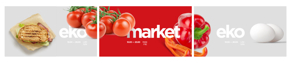
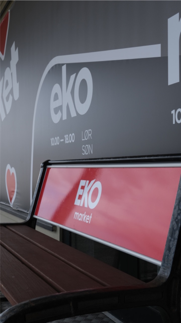
Interior and exterior, signage, façades and banners for every new store. One template that rolls out to new locations without the expression changing.
- 03
Print and campaigns
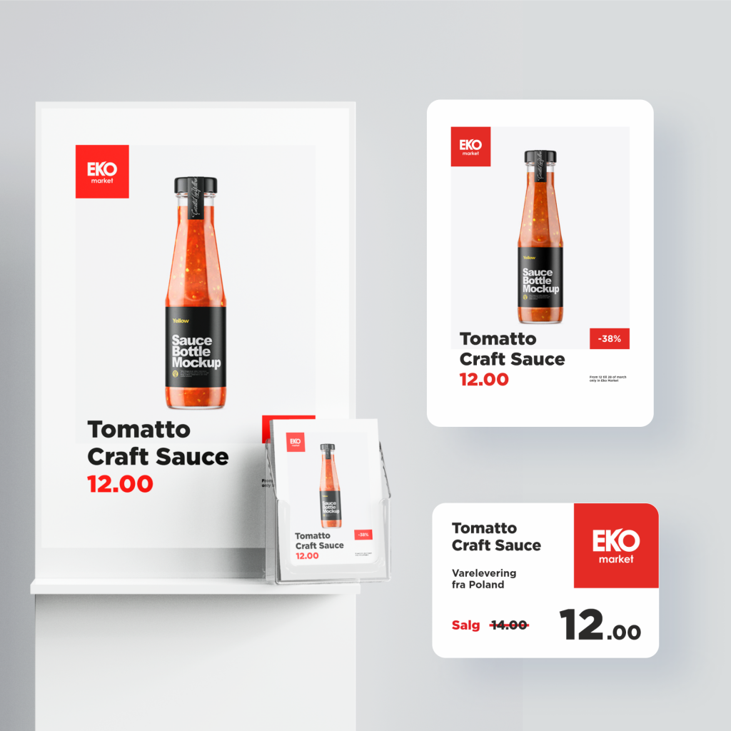
Brochures, shopping bags, workwear, outdoor advertising and campaign material — produced within the same system, year after year.
- 04
Own product line
We developed the chain’s private label: naming, positioning, visual identity and packaging design for 24 products.
- 05
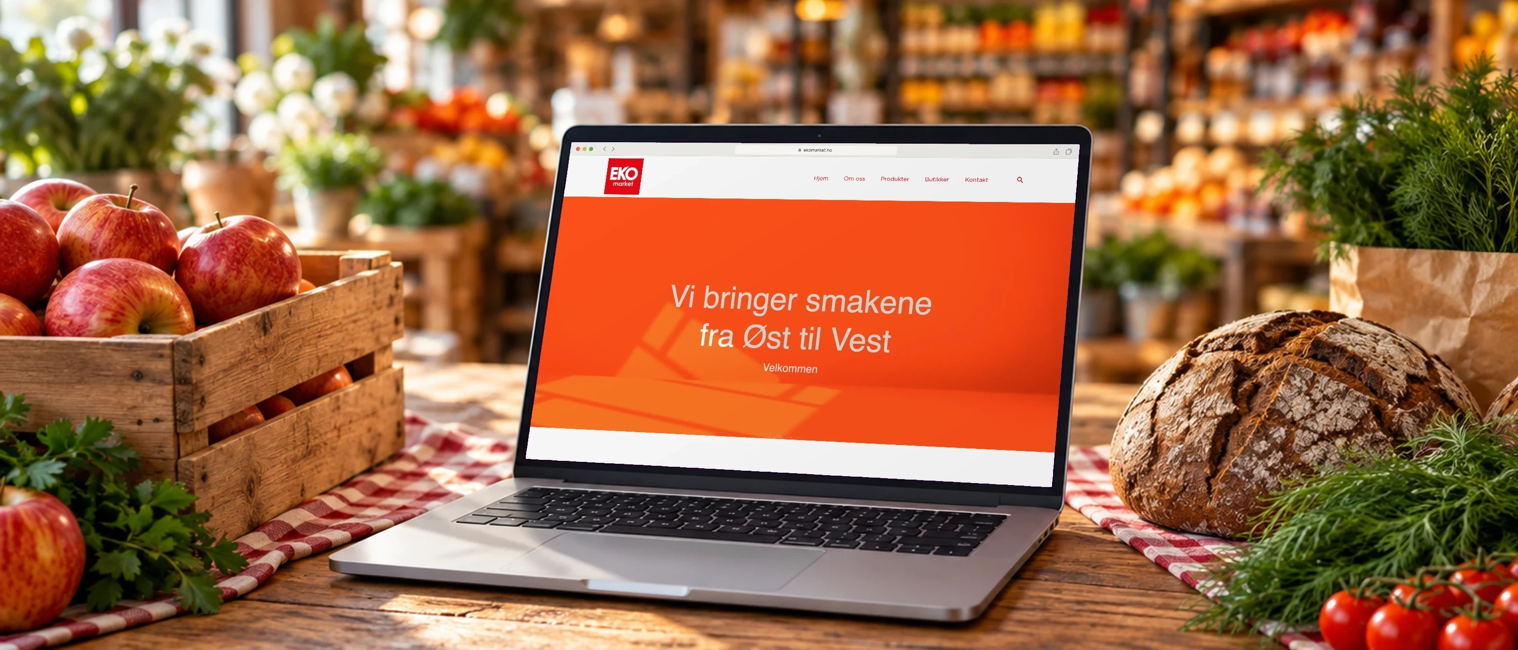
Digital and content
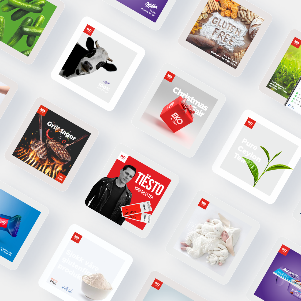
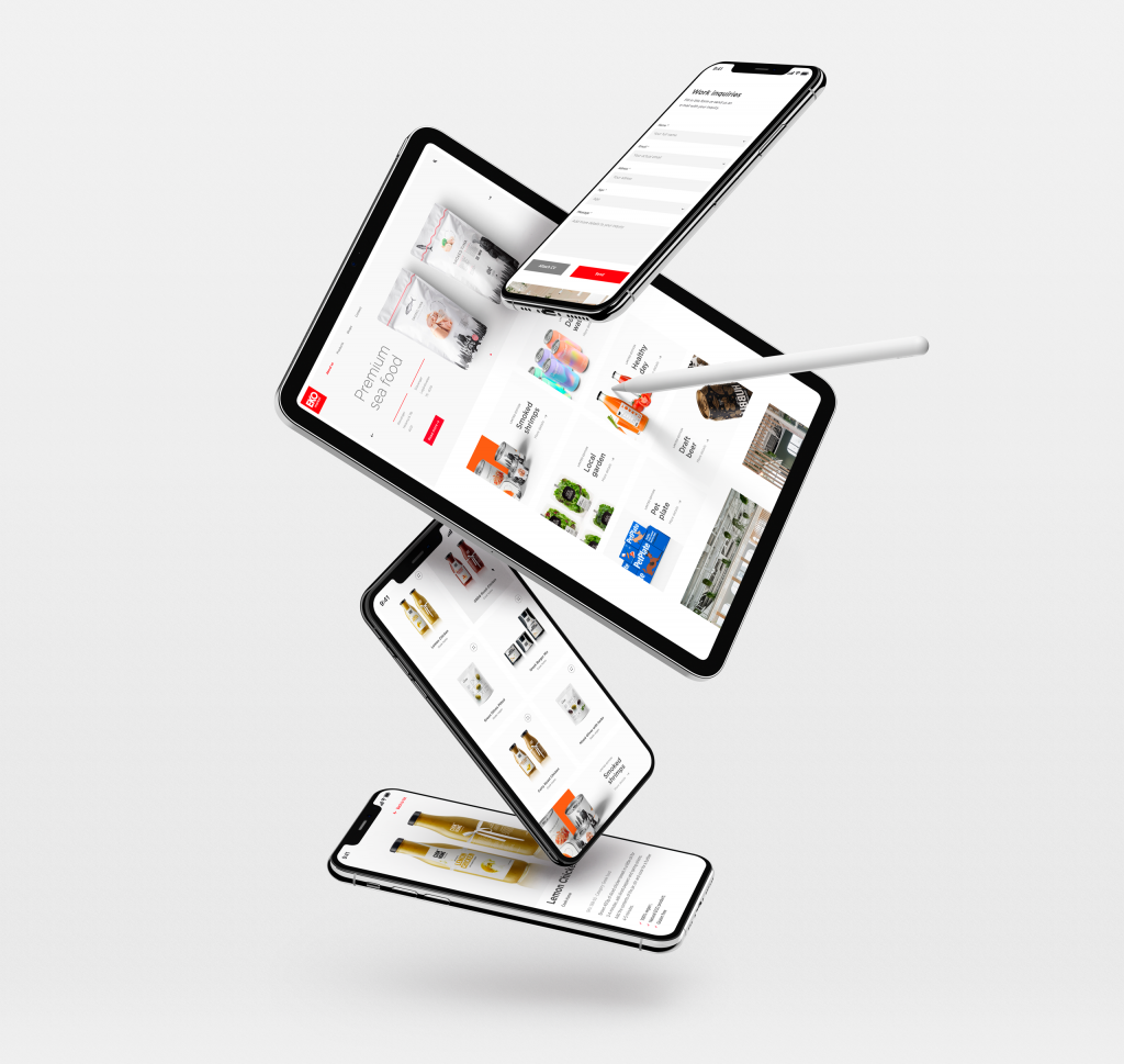
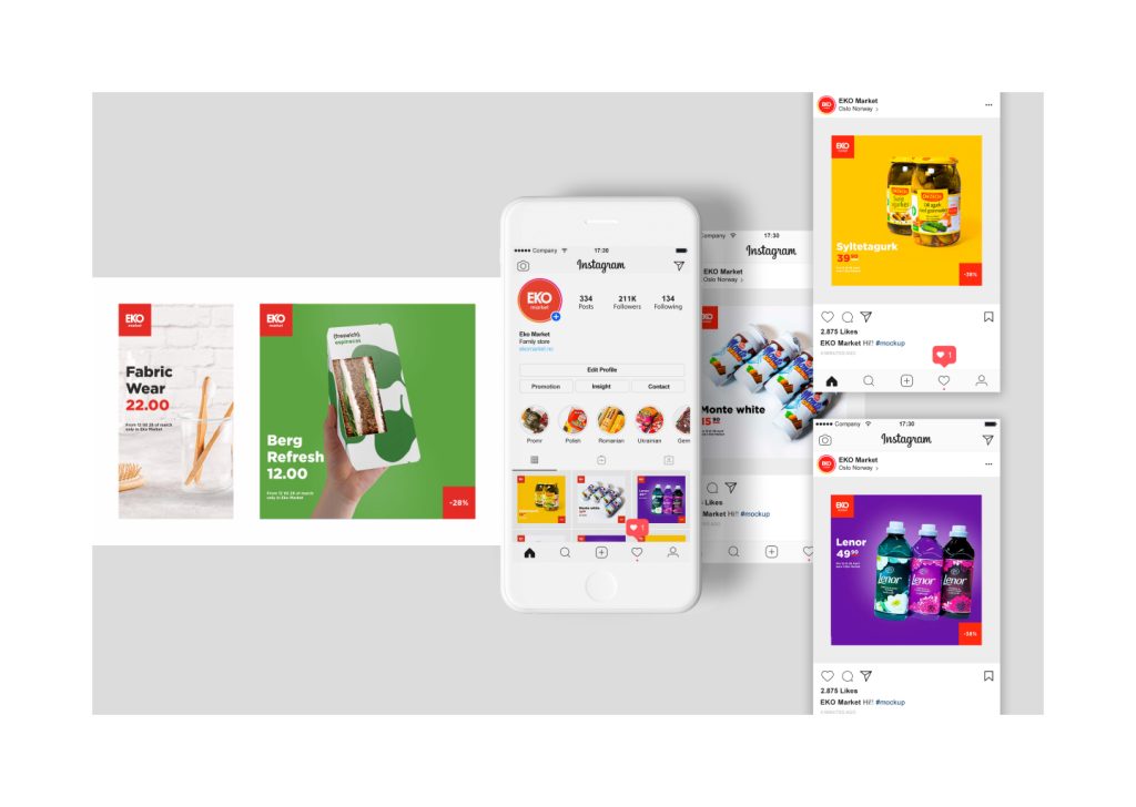
Website and online store, social media, photography, video and animation — so the campaign in the store and the campaign on the phone are the same.
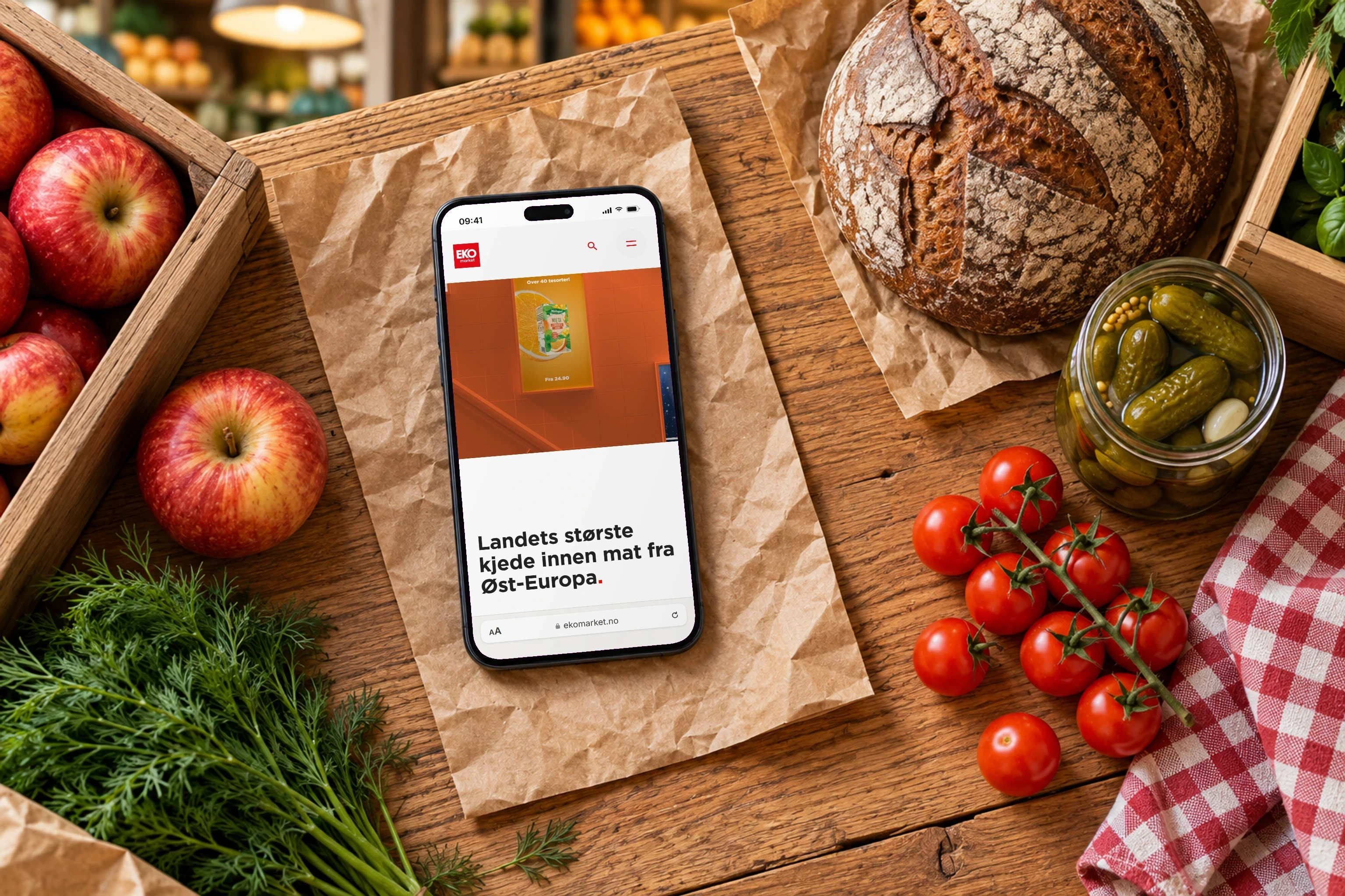
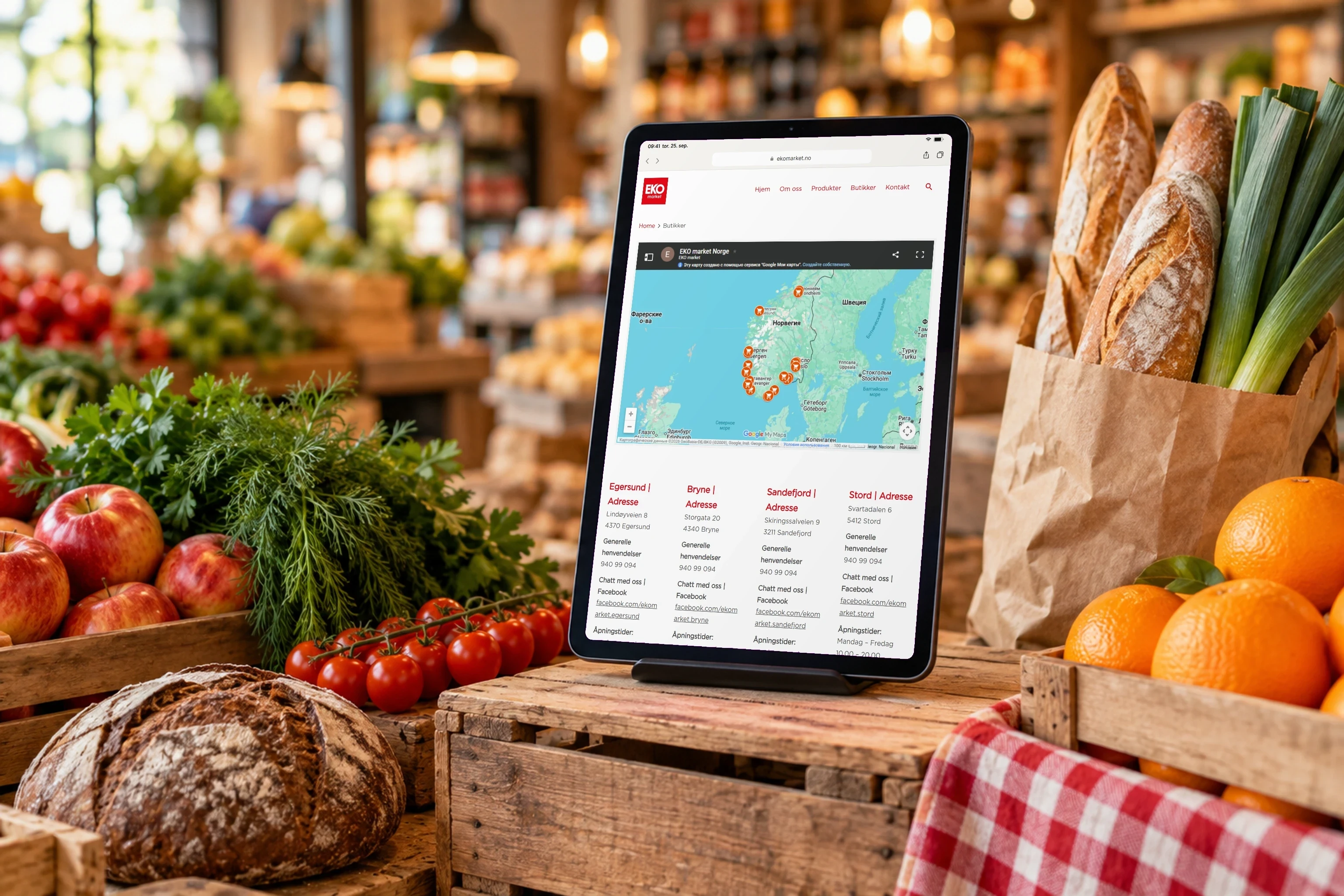
Mockup: real screenshots from the published solution.
Result
A chain that looks equally considered on the shelf, on the façade, on the bag and in the ad — and a supplier who has known the brand from the inside for nine years.
Do you have a similar project?